Showing posts with label Artists. Show all posts

Tuesday, October 2, 2018

Carlos Ezquerra

Some very sad news to wake to this morning: Carlos Ezquerra has died, after a ten year battle with cancer.


This is a huge blow for UK comics fans, and in particular fans of 2000AD and Judge Dredd. The affectionately-named 'King' CarlosEzquerra can be fairly described as one of the fathers of Dredd, providing the first designs of the future lawman, a mix of Death Race's Frankenstein and Conquistador - fitting for a Spaniard, perhaps. And to me, somehow, Carlos' work evoked a Mediterranean sensibility more than any other artist in Tharg's stable.

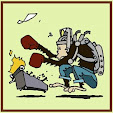
Carlos draws himself as one of Tharg's art droids


Ezquerra's work is there from Prog 1, and continued through to 2018, with very few breaks. He was a warhorse, from the likes of Battle (Easy Company) and Starlord (gifting the world of comics the brilliant space western Strontium Dog and its mutant bounty hunter Johnny Alpha), and even ventured to other IPC/Fleetway titles - a brief stint for Eagle, plus Crisis and inevitably the Judge Dredd Megazine. As the ubiquitous Dredd and Strontium Dog artist Ezquerra surely occupies the highest triumvirate alongside Bolland and McMahon. Speedy, prolific, and still eminently collectible, we'll see his work for some time to come.

The phrase 'making it your own' is a cliche, but so applicable to Ezquerra's adaptations. Dredd is such a robust character that he's endured countless interpretations, but despite occasional flirtations with other considerable talents, there's really only been one Strontium Dog artist, and even in prose I can't picture anybody in the role of Harry Harrison's 'Slippery' Jim DiGriz than Carlos' James Coburn lookalike in the Stainless Steel Rat series.


For me, though Ezquerra's  style barely changed, that was its greatest strength. Instantly recognisable, effortlessly consistent, but with a worldly, carnal appeal. His dredd and Alpha are virtually the same cloth - burly and tall, but not ridculously muscly, while his women (vampire bounty hunter Durham Red, femme fatale Angelina DiGriz) are pultritudinous, leggy and unapologetically curvy. Like many of the Dredd artists he delights in grotesques - besides Strontium Dog's colourful cast of mutants, Carlos drew a mean brace of Fatties for Mega City One. Even the robotic Blackblood on a rare outing in ABC Warriors is given an idle killer's pot belly. All with a knowing wink, each consistent and so meaty you could slice them like salami.

I still can't quite get my head around the Dredd mega epics entirely to his name: Apocalypse War, Necropolis, Inferno, Wilderlands - not to mention all those epic Johnny Alpha tales - Portrait of a Mutant, Wanted, The Killing. Phew.

My early collecting of 2000AD can be summed in Ezquerra covers: my earliest 2000AD cover by Carlos: Prog 181 (Johnny Alpha "It's taken my best shot - and it still won't die!), my earliest Dredd cover by Carlos: Prog 245 ("Let the Apocalypse Begin!"), and many more followed, of course. There'll likely be a huge tribute in the pages of 2000AD to come, and in the mean-time heartfelt tributes from the likes of Pat Mills, Karl Urban, and a good number of Thargs and Megazine editors past and present.

The King is dead, but his legacy will live forever.

Tuesday, June 6, 2017

Legends of RPG Art: David C Sutherland III

Whenever the subject of old school D&D art is mentioned, certain names will inevitably pop up: such as Erol Otus, Dave Trampier, Jeff Dee, and Larry Elmore  - some of the greater and most celebrated early artists of the TSR stable. But among the greater number of artists, including those no less recognisable, but for whom the ages haven't preserved in as high regard, there are other names which are perhaps less celebrated. And today I'm thinking of the late, great Dave C Sutherland III, who died this day in 2005.

You've seen Sutherland's art if you've seen anything from the early days of RPGs, including Holmes Basic D&D and its companion 1st Edition AD&D - hell, Sutherland's art to me is 1st Edition AD&D, good and bad.


It's unfair that Sutherland's work suffers the lot it has, while those of his immediate peers have over time accrued comparatively greater glory; and yet maybe it's because Sutherlands work sits so readily alongside the likes of Dave Trampier's and Erol Otus, that comparison damns him. Sutherland's art has been called a lot of things;  naive, 'aspirational', amateurish, goofy, and just ugly. The website Something Awful in its one-time series WTFDnD? lumped his work in the Monster Manual alongside other, earlier D&D Holmes era art, "Outsider art" - a deeply unflattering term. Sutherland's art is what it is - varied and variable, but I would say that when on form he truly held his head high. Just as Trampier had the Players Manual cover with its demonic stone idol and adventurers, and Otus Deities and Demigods, Sutherland produced the Dungeon Master's Guide and, for his sins, the Monster Manual. Though the latter has aquired a sort of kitsch following with its busy, garish and literal layout, there's nothing wrong with the cover of the DMG; the efreet depicted on it looks appropriately saturnine and dramatic, and his interior full page piece 'A Paladin in Hell' is a recognisable classic. Sutherland's box art for Holmes edition Basic D&D presents a shortform imagining of a D&D game conclusion, featuring a Fighter, a Wizard, a Dragon and its hoard. Sutherland was a literalist, if nothing else.

But then DCS was a player as well, and what I like most about Sutherland's art is that it is player's art. He played the game, sculpted his figures, and he mapped his adventures. In fact, among Grognards of the early years Sutherland's creative reputation exceeds his graphic works  - not only was he a valued a cartographer for some very highly regarded modules, but he created the Wemic and was co-creator of Queen of the Demonweb Pits. He's one of a breed of early TSR employees for whom their work was also their play, one of those special few around whom the game evolved. So then Sutherland's art is a touchstone from a time when D&D had left its wargaming Chainmail incarnation behind - but in a highly organic evolution; hence his Fighters wear chivalric chain and helms, or have swords-and-sandals well-proportioned arms and kite shields; his Magic Users are bearded, pointy-hatted conjurors, and his demi-humans scatter about their feet like children.Often these chracters are caught mid-combat, or in the base of the Holmes set and AD&D rulebooks actually exploring caverns and ruins, drawn from the days when adventuring was likely fifty per cent traipsing down corridors with a ten-foot pole. I like that Sutherland's art speaks to the foundations of the game and the less sanitised, cookie cutter heroic art of the recent present. And yes, at times it resembles the distracted, slightly scribbled marginalia of a player's Character Sheet, but that's authentic, too.

Alongside the illuminated style of DAT, Sutherland's 'DCS' (the C often styled to reseble an 'I', hence DIS and DAT) work in tandem, two sides of the same coin. Sadly, Sutherland's future with TSR post-Wizards of the Coast buy-out was lessthan triumphant, and feeling rejected by the industry he'd loved, his income and health suffered, and it was only in his last year, through the attention and efforts of fandom that his work was recognised and given real value. 

Saturday, October 31, 2015

Four Squares 4: A Bad Dream Primer

It's Halloween in the Monkeyhouse, and as a family we'e surrendered to its American Victorian trappings and just gone with it. I can pimp up a doorway with fake spiderweb like the best of 'em, and having family around with kids of Jet Jr's age gave us an opportunity to use his birthday party decorations from an abandoned attempt last year. So, on that note of ghoulies and ghosties and long-legged beasties, here's a book review.

Like a lot of followers of Hypnogoria I am of course in great envy of Mr Jim Moon's Great Library of Dreams, and as a sometime librarian I would have to admit that I too would love to have my own collection of ephemera and weird literature.  I don't, however, hence the intact marriage among other things like being able to move around inside the Monkeyhouse. I do own this, though, and it forms part of my very very small gentleman's collection of dark folklorey literature.

Time Life's mid-1980s Enchanted World series was a surprisingly vast and thorough collection of around twenty volumes about myth, folklore, superstition, legends and such. While I cut my teeth on Usborne's triple threat of its Mysterious World books, as a child and teen I never found anything to equal it in content and look, until I canched upon this volume in the Dunedin Public Library. Oh my youth, my young adulthood - the notion that I'd spentd up to three hours perusing the folklore section of a public library for Dungeons and Dragons ideas seems at once both quaint and alarming, but reader, I did. My Uni days were very dry days in roleplaying (for which I am actually quite grateful), but discovering this text, literally set alongside great works by Katherine M Briggs and Jorge Luis Borges, rekindled my interest in simple storytelling and creepy social psychology, untrapped from the stats and To Hit charts of the D&D manuals.

Nadilla, Persian vampire or ghoul?
Night Creatures, like other titles in The Enchanted World, is a long-form work, separated into chapters, but otherwise moving fluidly between imaginative storytelling (Beowulf, the Croglin Vampire et al) and scholarly interpretation. It's a surprisingly mature read, and contains some of the most atmospehric and in places downright grim illustrations I've ever seen in such a text - which, to be honest, is part of its apeal. It takes things seriously; its universal trinity of vampires, werecreatures and hags are all depicted as murky, shadowy and bestial shapes, among its roster of artists (including Tolkien great John Howe)  one Marshall Arisman, who uses a kinetic Francis Bacon-like brush in his pieces, adding to the overall memorable effect. This book stuck in my head for years, and whenn it recently appeared in a local secondhand book shop, I snapped it up on the spot.

Not seen: Annis' collection of child pelts. Yikes.
This work actually did what I hoped it would back in the day, rebooting my interest in traditional ghost stories and weird tales, and introducing me to previously-unheard of horros, like Black Annis, Rawhead and Bloodybones and their kin. It strove to be fairly international, in its coverage, although understandably sticks close to Europe, by way of Japan and Persia; plus it's a damned-fine looking book. I've been tempted to pick up other volumes in the series, but for the moment this is the daddy, and occupies pride of place in the upper shelves of the Simian Collection

Thursday, February 19, 2015

RIP Brett Ewins

Strange Days - Ewins channels Tenniel
I was very much saddened to hear of the passing of UK comics artists Brett Ewins earlier this week.

Ewins was at his height in the pages of 2000AD just as I began to take notice of it and started collecting. Through the middle era of Rogue Trooper and then on to memorable stints on Judge Dredd and its spin-off Anderson PSI Division, Ewins’ work was rarely out of the mag for long, and in time he’d notch up another well-loved series to his belt, the quite brilliant Bad Company.

His work made an immediate impression on me, for various reasons. It was recognisable, reliable, and easy on the eye – you could admire the brilliance of artists like Mick McMahon or Carlos Ezquerra, the robust meatiness of Cam Kennedy’s brushwork or the precise lines of Brian Bolland, but Ewins seemed more accessible to the illustrator in training. This isn’t to say his work was the less, or not as sophisticated than his stable mates, but to a degree – and in particular in Ewins’ middle era of the mid-Eighties in 2000AD, there’s the ability to anatomise his work; he paints with a heavy brush, all elements on the page readily-identifiable components; his work, while dynamic and obviously influenced by US comics artists, had a layered arrangement which was easier for me to pick apart and see how he’d put everything together. To this day McMahon at his height, and Kevin O’Neill with him, seem to defy compositional analysis on my part – some panels are brilliant messes – orgies of limbs and skewed planes, but Ewins’ work, which became crisper and more stylised over time, was a great lead-in to the world of illustration. I’d say that his work, alongside his colleague and friend Steve Dillon, was the style I most frequently looked to in developing my own meagre talents.


Judge Gellar, one of three Ewins covers for HoSH9
Personal favourites of mine seem to echo those of a lot of others from Ewins' portfolio – the psionic thriller The Haunting of Sector House 9 is regarded as a bit of a throwaway Dredd story, but it introduced some great characters in PSI Chief Judge Omar, and my favourite male PSI Judge the never-seen-again Judge Gellar, whose half-head of hair standing on end made for such an attractive prog cover. Maybe it was the fact that for such a short story Ewins provided no fewer than three covers for Sector House, but it with its spectral terrors, heavy line work and fun script, it was an early highlight in my collection.
The Possessed - Ewins channels Polanski!
Ewins also seemed the natural successor to Bolland in depicting Judge Anderson – other reliable hands like Cliff Robinson and Robin Smith had drawn her, too, but Ewins’ outing on the classic The Possessed cements the Eighties Anderson entirely – all bubblegum curves and Debbie Harry hair combined. Added to that his off-the-leash body horror panels and quirky design choices (Exorcist Judges!) made for a really fun strip. That same approach to the phantasmagorical led to Ewins and past co-creators Jim McCarthy and Pete Milligan working on the mad and memorable Bad Company, a SF Vietnam allegory on a heaving alien jungle world detailing the descent of a band of misfit soldiers into hell, led by their Karloffian sergeant Kano.
Looking back, I think Bad Company was Brett Ewins' peak at The Galaxy's Greatest Comic; despite being the first artist to draw ABC Warriors' Deadlock in strip form, despite Ewins' involvement in Dredd's The Day the Law Died, and visualising the Wally Squad, perhaps it's the unity of having one artistic team in  Ewins and McCarthy that makes the later series the most visually memorable.

After Bad Company came Deadline, Ewins' own title with Steve Dillon which introduced readers to Jamie Hewitt and combined Ewins' two loves of music and comics, being the mature readers' pop culture magazine that 2000AD couldn't yet manage to be. Though short-lived and seemingly doomed by the fate of its greatest character's movie adaptation, Deadline gave the world Tank Girl, and arguably in Ewins and Dillon Tank Girl has two godfathers.
Unfortunately the pressure of real-life deadlines and multiple commitments seem to have had a deleterious effect on Ewins' mental health, and as commissions suffered and dried up, the artist went into a long period of illness against which he fought to the endwhich contributed to his all-but disappearing from the industry. I remember seeing his work in 2000AD around 1992 - pretty much the last work he did for the title, and how it had diminished, becoming even more stylised, less textured, relying on tricks like duplicate panels and close ups, seemingly to cut corners - the whole effect was only increased by the early, flat computer colouring of the time. Not knowing the story behind the pictures, I was perhaps too dismissive. 
Like a blue Wendy O Williams: Venus Bluegenes
There's still a huge amount I love about Ewins' work for 2000AD. Much of it is of its time, a sort of Eighties Noir with Dutch angles and swimming in shadow. Also, it was a rare thing to see in the early years of 2000AD, but Ewins was  an artist unafraid to embrace the, er, 'cheesecake', and I'd be lying if I didn't say that his Anderson and Rogue Trooper's femme fatale Venus Bluegenes made a discreet impact on my flowering adolescence. I still reckon Ewins drew Venus best.

I hope we'll see a decent Ewins collection from Rebellion Publishing in time. For me, he is the epitome of the comic in the Eighties.

Friday, July 25, 2014

Friday Night Local: Chris Knox, 'My Dumb Luck'

Now, there have been a few upsets to a rough schedule in this Friday Night Music column, and today's entry is yet another. I didnd't intend to return to Chris Knox's music so soon after posting the Tall Dwarfs video a fortnight ago, and yet I didn't intend to go all J-Pop lat week either. This week was to have been either another female or all-female act, or a non-Flying Nun band from yesteryear, but instead I'm putting up another favourite video from one of Invercargill's finest former inhabitants.


My Dumb Luck is from Knox's 1988 solo sophomore effort Seizure, and is a typical track from the record (albeit a favourite song as well). I love the animation - it's simple, witty and creative, which are three things I also admire about Knox's compositions, as well as video and song here sharing a cyclical pattern. To this day I'm torn between appreciating Knox as a solo artist and for his collaborations, particularly with Alec Bathgate as the 'Dwarfs. By 1988 Knox's style was working its way into something of a groove, with buzzing guitars and looped percussion that wasn't a million miles from some Dwarfs songs (say, Crush), while the Dwarfs tracks remained more eclectic, sometimes more inventive and less direct, sometimes less accessible. I still like them both, although at the time I recall swinging fro Knox quickly and back to the duo just as soon. Was it the emergence of Knox's most famous solo song Not Given Lightly - a rueful, slightly cynical pitch at mainstream success (which did come after some time)? Perhaps. I never bought another Knox album after Seizure, with the exception of a cassette of Polyphoto Duck-Shaped Pain and Gum (whose stand-out track Inside Story was nearly a candidate for inclusion here - it's just not as fun as Luck) and the tribute album Stroke, featuring Knox's past work solo, as half of Tall Dwarfs or as frontman for The Enemy and Toy Love interpreted by his friends, colleagues and devotees. It's an impressive set of songs, and a testament to a creative spark whose work in music, film, animation, writing and cartooning seems to have been all but curtailed by a series of strokes five years ago. And I'm only just now thinking about how much Knox has inspired me in nearly all of these areas since I discovered him in my teens.

I'm posting this because there is a crowdfunding campaign underway to collect Knox's visual works in book form, Grafix Knox, next year - it's a great idea and deserves a wider platform, and you can find out more here!


Thursday, January 23, 2014

Jose Ortiz

On 23rd of December 2013 the world of graphic novels lost Jose Ortiz Moya.
Hombre
 Ortiz was one of the old school of European artists working in Fleetway’s stable in the 70s and through to the 80s, although he did far more than those familiar comics, and even worked with some bigger names, in particular Vampirella and the celebrated post-Apocalyptic series Hombre. A talent for portraying the macabre and desolated landscapes would serve him well, however, with what Fleetway had in mind for him.
Tower King
My introduction to Ortiz’ work was through Eagle and the- yes, post-Apocalyptic Tower King. Set in a modern London after the entire planet has had its electrical power ripped away by a rogue satellite, The Tower King nodded its way to Mad Max and his predecessors, but unlike, say, Damnation Alley or A Boy and his Dog stayed entirely within the city, sensibly taking up the opportunities its slow decay could offer visually – Ortiz’ sketchy style seems perfect for reducing such landmarks as Big Ben’s tower and, of course the Tower of London itself to dusty, matchstick ruin. I love the look of it, and Ortiz renders his hero Mick Tempest like his other leading men - weathered and drawn, sketchy and leathery, toughened by the challenging landscape around them.  Similarly, his turn on companion strip The House of Daemon drew on Ortiz’ skill with horror to produce a truly phantasmagorical strip that, in black and white simple ink, held its own impressively among the comic’s louder photo strips. I relished both Tower King and Daemon, and stuck with them until their equally satisfying conclusions (reliably, scripted by John Wagner and Alan Grant), but as I’ve described earlier on this blog, I didn’t linger with Eagle; my loss, in a way, because it meant that I missed out on the comic’s devouring of ill-fated horror mag Scream and the much-celebrated Thirteenth Floor series, a horror based around a sentient elevator which reunited Ortiz with Grant and Wagner.
House of Daemon
I’d moved to 2000AD, as the story goes, but Ortiz moved with me, providing the initial episode of a Dredd world strip I still harbour a soft spot for, Helltrekkers (Wagner and Grant again, testing the waters early for the Judge Dredd Megazine) and more ambitiously, a stint on Rogue Trooper, which moved the blue-skinned genetic infantryman from Nu Earth to the even more alien world of Horst. Ortiz’s turn (and the larger Horst storyline) isn’t recalled fondly, following as it does such a strong run by the likes of Cam Kennedy and an at-his-peak Brett Ewins, yet Horst’s weird, bestial soldiers based around the forms of bats, lizards and (to a suspiciously Gigeresque end) horseshoe crabs came out the better for being rendered by Jose, I think.
Rogue Trooper
So Ortiz, for an old-school artist, proved an effective bridging artist between my Eagle days and my 2000AD future. His work didn’t have the immediate crazy thrill of a Mick McMahon, Kev O’Neill or Ian Gibson piece (alongside whom he’d feature), nor the clean lines of Brian Bolland and his detractors, but instead alongside other Euro artists like Ezquerra, Massimo Belardinelli and Jesus Redondo, he’d bring in a fluid style that for a while complemented 2000AD’s woozy, weird and ravaged worlds.

It's a style which I miss already.

Wednesday, October 23, 2013

Doodle a day: 23/10/2013

Hello, and welcome back to Doodle a Day - the home stretch!

Today's doodle is a reaction to all the line art I've been doing recently. I feel like I've been shirking my responsibilities a little by under-drawing (or under-filling) my work; however, with a busy work and home life at present, I haven't really got time for big, detailed pieces, so today's contribution isn't too far a stretch, and it's monochrome again - but for good reason this time.


Cydonia was a comic strip I created back in the mid-Nineties for a small and plucky local Doctor Who fanzine called Telos. Taking its cue from Alan Barnes and Adrian Salmon's Cybermen one-page series in Doctor Who Magazine around the same time, Cydonia started out as a potted history of Doctor Who's resident Martians, the Ice Warriors. Within a couple of years Telos folded, and after a few more years I felt strongly enough to resurrect Cydonia and finish it, this time in another zine, and Telos' virtual successor, Reverse the Polarity!, which survives to this day as NZ's last remaining (semi) regular Who zine.  In RTP! the strip was rebooted and ran for four years - easily the longest sole illustration project I've undertaken, and in that time the story evolved into something of a elegy, with a little more depth and character than the original strip had contained. I'm still rather proud of it, though I must resist the temptation to revisit it again!

The above illustration, then, is an idea of a 'cover' for an imaginary compilation of the strip, incorporating an Ice Warrior, 'clamps' aloft (a familiar pose to anyone who's seen their eponymous debut story), main character Haaga, and the skull of a Locust, the series' creepy prehistoric bogeymen, inspired by the alien Martians of Quatermass and the Pit. The 'C' formed from the clamp is my nod to Salmon's contemporary cover for the charity zine Cosmic Relief!

Saturday, October 19, 2013

Doodle a Day: 19/10/2013

Another quick biro doodle. If I'm honest, this took a little more than fifteen minutes, but really not much more in the biro stakes at least.


In this day and age with Doctor Who still enjoying large audiences, even (ironically) in the US, it's become quite fashionable to diss the 'failure' that was a long-shot 'back door pilot' of the 1996 Paul McGann TV Movie. You can read more about the effect and influence of the realised TV Movie on Zeus Blog, but how to explain the image above? Well, it's another idea for what might have been seen in a TV series had early plans for a US-led Who come to fruition in the early Nineties. The 'Cybs', cyborg scavenging space pirates, are often blighted with the scorn of Who fans who see them as a poor and unimaginative Cyberman pastiche. I think that's unfair, and even in the brief sketches and descriptions that can be gleaned from this abortive series bible, you can see that creator John Leekley was attempting something different - a fusion of mad Max/Road Warrior post-bomb savagery with elements of cyberpunk and space opera. Unlike the Cybermen of the Seventies and Eighties the Cybs have names, entertain themselves with belly dancers, and exist to plunder - a far cry from Who's emotionally-removed anonymous drones,whose schtick in the early Nineties was itself being seriously plundered by Star Trek's Borg Collective. Had we seen the Cybs appear on the small or big screen, I think they'd have fared better than popular belief might have it, and maybe it's only the fact that their story ideas in the 'bible' are adaptations of classic Who's Cyberman stories that really offers comparison. They could have been hokey, cheesy even - but they could have also been scary and a lot of fun.

My biro went a little bit fluid here, and perhaps I shouldn't have erased the original pencil, because what appeared on the page before that looked like something resembling the work of fantasy artist John Blanche. Ah well.

Sunday, September 15, 2013

Legends of RPG Art: Dave Trampier

Baalzebul
Depending on where your loyaties lie in ranking the early artists of the Dungeons and Dragons rulebooks, the work of Dave 'DAT' Trampier will probably at the least lie in the top two. I've expressed my admiration for the phantasmagoria of Erol Otus' work already, but it's fair to say that if at my age you found Otus' work a little goofy (as I did back then), then the more realist and studied work of Trampier would probably suit you well enough. Working primarily with pen and ink and employing heavy light and shade contrast - frequently in a pseudo-woodcut style, Trampier's illustrative work for the Players Handbook, Dungeon Masters Guide and Monster Manual afforded all three volumes some real gravitas, particularly when set against the work of his fellow illustrators. Which isn't to say Trampier couldn't deliver with the fantastic monsters - in fact, classical and traditional beasts seemed to be a forte of his; here's the arch-demon Baalzebul, for instance, while his tiger-in-a-smoking-jacket Rakshasa, sinuous Medusa and ragged, wild Wight have become notable versions of those creatures, despite clear or not-so-clear descriptions preceding his work. In fact, like Russ Nicholson's Githyanki and Otus' Drow, it looks as though Trampier's Wight has in fact become the definitive version of this creature.

Of course, an artist as talented as Trampier could also be relied upon to bring life to the more mundane monster as well. here's one of my favourites of his from the Monster Manual, a creatively laid out illustration accompanying the entry for the Giant Wasp:


Note also the traditional garb of the unfortunate warrior - horned helmet aside, this smacks of early D&D aesthetic to me; recalling historical war gear for its heroes rather than Hollywood avant garde. Somehow making the appearance of the human in the piece more rooted in human history (or at least conventional Fantasy of the time) makes the wasp appear more natural as well - and yet, for its size, all the more threatening with it.

Elsewhere, Trampier's work is celebrated as much for its tendency towards vignette as its simple illustration. Mention the captions 'Lost in the Briars', 'Honour Amongst Thieves' and of course 'Emrikol the Chaotic' to a well-seasoned player and they might understandably go all misty-eyed at the instant mental picture each summons; Trampier's skill in composition and execution of often dynamic scenes were simply that effective. This does bring an interesting element out in Trampier's work, however, as down the years eagle-eyed admirers of his work have discovered some real-world bases for his D&D portfolio, such as the street Emrikol races down in his orgy of destruction being the real-world Street of Knights in Rhodes, or his Cloud Giant portrait borrowing heavily from a 19th century etching from H J Ford. It's likely a testament to Trampier's following that such discoveries haven't been framed as attacks on the artist's creativity, but offer instead a knowing wink to the man's obvious talent and broad influences.

Perhaps the most-celebrated of all Dave Trampier's work is, fittingly, the cover for the original AD&D Player's handbook, an enticing scene of dungeon-based plunder that, to my eyes at least, look like they might yet invite more trouble than those giant gemstones are worth...


Legend has it that Trampier himself appears in cameo as one of the adventurers in this piece - possibly the chap in brown, centre left. The picture is another or Trampier's most famous vignettes and has been much reproduced, imitated and treated to homage by fans and admirers alike - Wizards of the Coast even used a reworking of Trampier's cover when relaunching the D&D line a couple of years ago.

Outside of the three manuals Trampier produced work for TSR's other RPG lines, including Gamma World and TSR's own RPG magazine Dragon, for which the artist employed his equally-accomplished cartoon techniques for his long-running and much-missed back page serial Wormy, which really brings me to the final chapter in the story of Dave Trampier as a fantasy artist. In short, for reasons best known to the man himself, Trampier abruptly and seemingly without explanation severed his connection to TSR, the gaming world (in which he was also a developer) and illustration entirely, apparently resurfacing reluctantly some years later in a newspaper feature about cab drivers in Carbondale, Illinois, and shortly after this time it became more widely acknowledged that the man wanted no part in his former career or legacy (more can be read here.)

The man has probably inspired more artists than he may imagine (myself included), and yet  the circumstances of his disappearance and lifestyle change should be respected and rightly left to the man himself. Dave Trampier's work in cartoon and illustration form is rightly revered among older fans for its unique style, consistency and undeniable imagination. Here's to you, Tramp...


Thursday, February 28, 2013

Tuwhare / Hotere

Back when I first launched Jetsam my plan was to begin proceedings with a post about the then-recent passing of Hone Tuwhare. The content of the post would have been brief, unfamiliar as I was and still am, relatively, to Tuwhare’s work. With the death this week of collaborating artist Ralph Hotere it therefore seems fitting that I revisit that early draft, concerned as it was with one of their better-known joint works. As a young Simian I entered Otago University without a firm geographic compass point. When you are new to a large space of buildings, concourses and hallways you make do with what you recognise and stick around with familiar spots, even if you’ve no business being there study-wise. Otago University’s then Hocken Building, monolithic and shaped like two great Brutalist stereo speakers amid bluestone and concrete precincts, was one such place, and indeed in my first year, apart from the odd exhibition at the small Hocken Gallery and foray into the library of the same name, there wasn’t much reason for me to be there. It was an effective short-cut from the banks of the Leith to the Student Union lawn, though, and on rainy days it was a decent enough, if echoing dry spot. On Fridays I’d go there to take a lift to my doomed Anthropology and History tutorials, and visit the gallery on the way out. For the rest of the week I’d be elsewhere. Easily the most box-like of all the building on campus, it seemed especially closed-off and sequestered, and not in the charming way of the university’s other, older buildings and theatres. I never really warmed to it.

 But what I did like, my favourite part of the building in fact, was the triptych hanging in its ground floor entrance; three canvas strips of speckled grey, white and black, like a Dunedin footpath in a February sun shower. At the foot of each banner in the painterly hand of its artist Hotere were the words of Tuwhare’s Rain. As an artist Hotere’s also work never really struck home with me. I used to find him a bit suspect, unnecessarily derivative of ‘better’ artists like Colin McCahon. If that’s a short-sighted judgement then maybe I was jaded at the same time, Hotere’s work being in the late 80s and early 90s as ubiquitous as his presence in the Otago artist community. So familiar as to be taken for granted. I would walk past a lot of his work seeing instead aspects of other artists in the bold streaks of red and white against deep fields of black and brown. Expressions and political concepts condensed into stencilled letters and numerals, spatters of that same palette on vast canvases creating a spectacle, but not really saying anything to me.

 My first encounter with the Hocken building was my first encounter with the poem and the artwork, and for an even younger would-be student fumbling his way through the campus on a day-visit for my final year of school, the encounter resonated fully. I don’t remember much of my seventh form year’s studies – just English (which I’d continue with at Otago) and Art. I still fumble with verse to this day, to be honest, but there in that triptych was for me a perfect and seamless melding of the visual and the figurative; Tuwhare’s raindrops realised in Hotere’s long dappled banners, the verse scrawled as though committed quickly in a stream of senses. That year I’d learned the power of negative space in painting, and though Hotere’s Rain afforded none in its canvas borders, to a small onlooker in a gargantuan concrete building in a new and fascinating place, that space found me. Many times I’d return to that triptych in my time as a student and look up at the hanging above me, and on each viewing, like Tuwhare's voice in the rain, I’d find it again.

I can hear you
making small holes
in the silence
rain

If I were deaf
the pores of my skin
would open to you
and shut

And I
should know you
by the lick of you
if I were blind

the something
special smell of you
when the sun cakes
the ground

the steady
drum-roll sound
you make
when the wind drops

But if I
should not hear
smell or feel or see
you

you would still
define me
disperse me
wash over me
rain.

Hone Tuwhare 1922-2008
Ralph Hotere 1931 - 2013

Friday, September 9, 2011

Legends of RPG Art: An Artist Reponds

During a recent tidy up of the blog (ongoing, alas) I found to not a little embarrassment a comment on an earlier piece on Russ Nicholson by the great man himself. I remain humbled and not a little shamefaced for missing it.

Much of which is to say, it's great to see that not only is Mr Nicholson still working, but he also has a blog!

So you should go there. It's brilliant, believe me.

And just because I enjoy it, here's another shot of one my favourite Nicholson pieces, the title page for Ian Livingstone's guide to the RPG phenomenon, Dicing With Dragons. Great lines again, with some fine muscular rendering and those cool mountains in the background. I always fancied that this was perhaps in part a portrait of Ian himself, sans glasses and moustache!


Sunday, March 20, 2011

Charles Burns - Black Hole

"It's impossible… nnn…never make it out alive"

Adolescence is hell. The flipside of being at our most potent and energetic stage of life is for much of those years a lack of real control; of emotional impulses, our hormones and the development of our changing bodies, and outwardly our social and family groups, and imagined destiny. Charles Burns' Black Hole takes a walk through these dark woods of impending adulthood - the wilderness at night is a recurring location for the stories within, and in its gradual opening reveals a world of repulsion, guilt and questionable decisions. The re-telling of a journey to adulthood as body horror.

This collection was recommended to me by Tim who in turn had had it passed on to him by an enthusiastic friend. Black Hole is the culmination of a decade's work by Burns, and in design it shows. It's a heavy work thematically, but physically its weight may be added to by the sheer expanse of black ink used in the strip's monochrome palette. The artwork is often symmetrical, with panels mirroring one another across page spreads, and the white detail on the literal black hole of the graphics providing startling retinal after-images. It adds to the general trippiniess of the subject matter, and is a perfect visual impression of one of the story's big themes - the claustrophobia and loneliness of the developing teen. Forming the story are the experiences of four teens - stoner Keith, the A-student object of his affections Chris, her boyfriend Rob and would-be artist Eliza as they variously fall prey to the Bug, a physical and sexually-transmitted mutation that offers no special insight or super powers, just the certainty of being ostracised.

I was surprised to read that among the excised material in the anthology edition I'd read is a yearbook quote from an unnamed afflictee set (probably) some time after the story, suggesting that the Bug's outward manifestation is temporary, underlining its association with adolesence and pre-adulthood, but at the same time offering a potentially happier ending for (most of) the protagonists. That this is removed in the later version means that this hope for a happy conclusion is taken away, and the angst of the present, however temporary, remains. I'm in two minds about this; the story is frustratingly open-ended in places - as much as its focus shifts within the narrative anyway, so a likely resolution is welcome. On the other hand this sort of resolution is clearly not what Black Hole is about, any more than reaching the age of true adulthood, however arbitrary, is. If adulthood is personal responsibility and responsibility towards others then the three survivors are severally already there.
As a reader anchored in the Seventies and Eighties I really enjoyed the visual aesthetic of Black Hole, and the painstaking attention Burns gives his page compositions. The artist's work has for along time evoked to me the work of older titles - the EC horror comic covers, hippie-era psychedelia, and retro-rock art (no wonder informed by Burns' artwork for Iggy Pop's Brick By Brick, an album I didn't own but had a lot of time for back at Uni). The story weighs more towards the emotions of its various beats and character moments - not all of the mysteries are really solved, and fittingly there's a large figurative question point at the end of the book. It's an unsettling read - Freudian, Jungian, Proppian; in short, its own dark space I was content to visit briefly, and leave behind afterward.

Postscript: A movie adaptation is currently in development hell, but a very good short distillation can be found here. For obvious reasons, really NSFW.

Sunday, August 29, 2010

Putting the Fan Film into Fantasy Films

Not quite in the wake of Judge Minty, here's an earlier stab at the 2000AD-based fan trailer; a mock trailer this time, and in French. I'm sure its writer would approve nonetheless given his work in French press.

Voici Pat Mills' Slaine the Horned God, based on the book of the same name by Mills and Bisley, and reproducing the latter's work with admirable devotion!


I didn't think it too many, etc.

Wednesday, August 25, 2010

Judge Minty fan trailer

Courtesy of Dave who also sent me a Fleetway reprint of the original strip a while back, it's the Judge Minty teaser for the forthcoming fan film:


I am really impressed with this. particularly for its devotion to the look of the story - all very faithful to the comic's design with Lawmasters (bike cannon!), the Grand Hall of Justice, Mega City One's Gherkin-like buildings (a Mick McMahon innovation) and of course Carlos Ezquerra's iconic design of the judge uniform. Oh and Dredd of course, played by Dredd artist Greg Staples with nary a smile or removal of helmet - as it should be. So much of this deserves further explanation - it would have been easy for the makers to stage this on an industrial site or warehouse interior with official Termight replica helmets and hardware, but they didn't . It might have been obvious to some to include as Dredd's cameo a strapping 'roid-fuelled stand-in for Old Stony face, but the slighter, leaner Staples is truer to the original, and to McMahon's version as well. I do wonder about the palette and 'look', particularly after seeing similar and less-impressive stuff on Spartacus recently; the digital stage and bleached screen has dated since the likes of 300 and Sin City, but it's not enough to put me off at all. More information here of course, in the mean-time, messrs Garland, Travis and Urban - take note...

Wednesday, May 12, 2010

Legends of Fantasy Art - Frank Frazetta

Frank Frazetta died this week, aged 82.

For many his name will be synonymous with the pulp fantasy and SF of Robert E Howard and Edgar Rice Burroughs - his Conan is simply definitive, and his approach to the human form of both genders made him the foremost and most logical artist of Burrough's Barsoom/Mars books. As I mentioned earlier in my Erol Otus piece the works of Frazetta and to a lesser extent Boris Vallejo were probably the leading examples of 1960s and 1970s fantasy art, and Frazetta went on to inspire a host of artists and cartoonists of the next generation including White Dwarf's Peter Jones, and Carl Critchlow (whose style he initially lampooned in his Thrud the Barbarian), and in 2000AD most crucially, Simon Bisley. Bisley was directly influenced by Frazetta's oils as well as his pen and ink washes, and his adoption of those styles, borrowing Frazetta's earthy palette and accentuated musculature both reinvented the look of two key series by Pat Mills. The previously angular and robotic ABC Warriors became heavy metal beefcake (though done in Bisley's earlier line drawing style) and Celtic hero Slaine in the acclaimed Slaine the King
remains a highlight for Bisley's studied and faithful homage to Frazetta (even down to the aforementioned palette) as much as Mills' own stripped-down narrative. Bisley's tribute marked something of a visual homecoming for a fictional hero whose legend-based roots owed as much to Howard's barbarian hero.

I wasn't always a fan of Frazetta, and didn't come to reassess his work until seeing Bisley's work which some at the time and since have called derivative (the irony remains however that for nearly ten years on from Slaine the King 2000AD's pages were cursed with the mud-coloured muscled monstrosities of lesser artists, each bearing the unmistakeable hallmarks of slavishly copying Bisley himself). He remains a colossus in his field, his heroes seemingly hewn from the same rocky terrain they inhabit naturally. Where other artists sometimes use terrain as a backdrop or pagefiller, Frazetta's appear to rise from that chalky earth, his heroines graced with the same watery luminosity of their dungeon environments, or as perpetually buoyant as the Martian gravity around them. It's work in caricature sometimes - the warriors sinewed, biceps and thighs bulging as they pose, crouch and fly in battle, their womenfolk equally underdressed to show off the curves, the flowing locks, the undulating concupiscence. Great fodder, as I mentioned earlier, for album covers, movie posters and panel vans, the pop culture canvases of the Seventies. Small wonder then that as ideal body shapes changed into the Eighties Frazetta's work was seen less, and for a good time the airbrush became the champion of fantasy artists. But Frazetta had flow, the style that oils and brushes demand, the medium being so very unforgiving. His subject matter is visceral and as utterly testosterone-led as the stories behind them, which probably explains more than it needed be said why my earliest brush with the master's work was some sneaky peaks at my older brother's borrowed volume of Frazetta art as a very young teen; each portrait a doorway into older, wilder, savage and erotically-charged worlds. And yet to this day I'd be more comfortable in public with that volume under my arm than the likes of say, Vallejo or Chris Achilleos whose work alongside is endlessly glossier, sleeker, more lurid and less elemental.


They really don't make them like Frank anymore.

Wednesday, April 21, 2010

Legends of RPG Art: Russ Nicholson

Chances are if you played a UK variant of a roleplaying game in the 1980s you would have come across the work of Russ Nicholson. Nicholson's distinctive line art graced the pages of the Fighting Fantasy game books, White Dwarf, and its contribution to the world of Advanced Dungeons and Dragons, the infamous Fiend Folio, among other publications. It's in the Folio that his work shows the greatest range and alongside occasional contributions by Erol Otus and some notable UK contemporaries, Nicholson's linear, pointillistic style is the most prominent. Like Otus his concept for a monster, the Folio's Githyanki (originally for WD) survives and remains the definitive visualisation, imitated by successive artists to be one of the few success stories from the book.

Unlike some others of his time Nicholson's approach brought with it the artist's intimate knowledge of historical war gear, which isn't to say his pictures were faithful to history, rather that they were used sympathetically - armour was often rendered a mismatch combination rather than a full-suit (or worse, the deaded chainmail bikini and its variants). He seems to have eschewed the likes of plate mail for the more visually intricate and interesting ring, chain or scale mail. For small work Nicholson's work is sufficiently detailed that you can get lost in them easily, and it remains the main reason I still admire his style, indeed, he's the first fantasy artist I tried to mimic as a teenager. His approach is rarely static in a form (usually bookplate illustrations or monster portraits) that doesn't always invite dynamic poses or movement - but there's movement of line and of shading evident in his work, and a great sense of weight in his characters - he renders flowing robes beautifully, tongues of smoke curl from his dragons' snouts, the rotted clothing of a zombie barely held together, seemingly shredded with decay. His figures are for the most part contrived to be thin or drawn, his goblins especially having pointed features and long noses and limbs, but Nicholson's work isn't strictly speaking all grotesques, as this rendering of a Houri for WD shows, exotic but unfussy, betraying his confessed admiration for the works of Aubrey Beardsley. Of all his work it remains one of my favourites, a great composition with clever use of line weight.


While Beardsley's fantasy work took in the creations of Poe and Wilde and classical mythology Nicholson's artwork features heavily in the 1980s RPG revival of that literature, including a stint illustration Puffin Books' two licensed Robin of Sherwood game books. Coming from his later work it's a little less interesting and a little more realistic - I definitely prefer his early Eighties work, particularly that of his Fighting Fantasy contributions, and namely The Warlock of Firetop Mountain and The Citadel of Chaos. In fact thinking of those books and their shared world of Allansia, it's Nicholson's artwork that draws it all together for me as the definitive version, an alluring combination of the high, exotic fantasy of, say, the Arabian Nights, and the grimier low fantasy of Lieber and the shabbier corners of Middle Earth. And speaking of which, what could only be a Balrog, the only Tolkien-derived image I could find from the artist, and in colour too.


Edited to add: My sincere thanks to Russ for his comments and clarification below. The above isn't one of his works after all, alas. Thanks for visiting, sir!

Tuesday, February 23, 2010

Legends of RPG Art - Erol Otus

Erol Otus. Eight letters, four vowels, two magic words.


Along with Ellenmoor and Mount Silverberg, the seafaring Elf-king Aerelotus is a name from my old RPG fantasy world based devotedly on a real world counterpart.
To me the art of Erol Otus is 1970s Dungeons and Dragons, as much as multiple polyhedral dice and reaction rolling on village NPCs. Each revision of the D&D rules set has carried with it a distinct fantasy aesthetic - the 1983 Basic rules ushered in the studied sketchiness and painterly cheesecake of the Jeff Easley and Larry Elmore illustrations, while the 2nd Ed AD&D Monster Manual opted for a unified look to its creature catalogue using a block-coloured comic strip style. From the 3rd to the 4th edition the internal illustrations have been more complex, but also more homogenous – their unity and slavish naturalistic palettes I find rather too prescriptive (much like my impression of the revised rules themselves), and would fit in a police line-up with movie conceptual art from, say, the recent King Kong or Narnia movies without standing out - to their detriment. There’s no risk of that happening with the 1970s D&D art, and nobody’s come close to aping the work of Erol Otus.

Seventies RPG art gets a bit of stick for being clumsy, amateurish and cheesy, and to be fair there’s a good amount of it that is, particularly in the old 1st edition Monster Manual, but a lot of that artwork was groundbreaking in a way, coming from a time when fantasy art itself was a genre largely set aside for paperback covers, record sleeves, posters and panel vans. If the titans of that decade’s art were the likes of Boris Vallejo, Frank Frazetta and Christos Achilleos you can understand why their styles weren’t often seen in the pages of RPG literature. In most cases they simply don’t match the rag-tag pick and mix influences of the game – part Tolkien, part Vance, part Ashton-Smith, Leiber, Lewis, Aesop, Swift et cetera. The answer to visualising such a hodge-podge world (not that anyone was asking) worked best by either going down the traditional route (Dave Trampier’s exquisite woodcut-style creatures and tableaux) or farther out - perhaps somewhere akin to the Odd Rods cards of that era. Guess which one Erol Otus was?


It was years before I dug Erol Otus’s style, usually opting instead for some of the more realistic and traditional, clean-cut works listed above, or the smooth lines of Jeff Dee’s comic book figures. But in returning to the game years afterwards Otus’ vivid and lurid paintings are the ones that last and still enthral me. You won’t find many pictures of traditional mythological monsters in his portfolio, and even those you would find carry his signature details – smooth, almost fishlike skin, spines or webbed feet, goggling glassy eyes, grinning maws. His Lovecraft interpretations are borderline goofy, but are all the more unearthly for it, compared to the Gigeresque examples you’ll find elsewhere. His heroes are similarly unorthodox – a blend of heroic Greek, high fantasy and Nordic myth, with no breast unplated and no helmet un-horned, un-winged or un-crested. His pictures of dem-ihumans are rare (except for the Elves and Drow he painted, which surely defined the look of the latter thereafter), and I don’t think he could have drawn a Gandalf-styled Magic User to save himself – his examples look more like Biblical magi. A breath of fresh air. Similarly his boldness with colour and light are arresting, often blending complementary colours like yellow, green and purple to produce skin tones and clothing and even skies that seem to owe more to the hues of marine biology than anything above ground.


There have been hundreds of great fantasy artists working in role playing games over the past forty years, but I can’t think of a world more alarming, horrific, or more vibrant and fun that I’d like to play in than that of Erol Otus.

Saturday, January 30, 2010

White Dwarf - the Old School journal

I'm currently reading Bob Fischer's rather wonderful memo of the UK telefantasy convention scene, Wiffle-Lever to Full! and having got to the chapter on Discworld and Terry Pratchett fandom, am amused to note the author's bemused/cynical observation of the large crossover between Discworld fans, leather coats and Iron Maiden tee shirts. After admitting that he's not averse to Maiden himself ("the 80's stuff at least. Well, the first two albums really") Fischer skips over to reminesce over his own 80's teenage years of playing Dungeons and Dragons (at an age approximate to mine, and similar years too) and listening to said band. It intrigues me, because if you replace the Pratchett angle with 'low fantasy' and a sort of post-Python mocking college humour, exchange Maiden for any number of NWOBHM/Post-prog music and swap the leather coat for... whatever horrid equivalent couture existed back in 1984, then you'd have some key ingredients to what form my impression of the UK RPG scene.

Certainly pre-1988 White Dwarf seems to fit this bill, staffed as it was by bearded ex-university types, contributed to by... maybe more university types and appealing to the same as well as a horde of younger, spottier types such as myself. I've long held the belief that there's a specific boundary of fantasy literature in the Atlantic, and compared to the loftier 'original' from Wisconsin, the D&D played by British adherents seems altogether more earthy, grubby and less serious. That's a sweeping generalisation, but I believe the mindset's there, and indeed continues in the more recent, longer-lived incarnation of White Dwarf today, as Game Workshop's Catalogue That You Have To Buy (tm).

I've read mocking, condescening appraisals of old WD on the Net, but I love my old issues and will probably never part with them (sorry dear!) For one thing they're in a terrible state and only the most desperate collector would want them, having been pored over countless times for new tidbits from other gaming systems (as WD covered back in the day - Runequest, Traveller, Call of Cthulhu were popular ones) to cannibalise and insert into my D&D games. While the US gaming title Dragon was more product faithful and was certainly worthy in its own right, White Dwarf seemed bigger on the inside, and had a defiant streak of wit in its pages, with a must-read Critical Mass fiction review column by Dave Langford, and Thrud the Barbarian and Travellers, satirical strips by future 2000AD artists Carl Critchlow and Mark Harrison. In fact, so attached to my issues was I that I'd forgotten just how few I really had, having to buy them for the most part during trips down to Dunedin while visiting my brother at Uni. Between freinds and I the numbers swelled to possibly early into the double digits, but again, the great Puritan Burning of Roleplaying Game Stuff in 1987 saw to that, and by then my gaming and White Dwarf reading was itself on the wane. Within months in its parent country the magazine radically reinvented itself and evolved into the survivor it is today. But for posterity, and excluding a few Best Ofs and downloaded copies, here are the issues I have.


Oh, almost forgot the Chris Achilleos covers - how cool were they!